Tuesday, March 22, 2005
Near Misses, Also-Rans, and The One That Got Away
My West Coast photo-pal Warren sometimes shows photos and asks, "does this work, and if not, why not." And, although most of Warren's images "work" quite well, it can be a worthwhile excersize to look at a "not quite", and ask, "why not?"
So even though I must be violating some cardinal rule of psycho-photo-insecurity, here are some of my photos that I thought would work, but just didn't.
This first photo is actually the most recent. I took it on that overnight trip to Bethany Beach last month. Sandy and I headed a few miles South to Ocean City, Maryland, where I spotted these rows of colorful trestle tables at a closed-for-the-season crab shack.
It sure looked as if there would be something there! All that repeating pattern and nice colors in the sun... It looked pretty good on the camera's little LCD, too. But back home, even cropped, contrast-adjusted, and sharpened, it just falls flat.
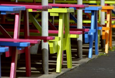
Colorful, but so what?
Maybe it's the big triangle of nothing-gray at lower right - I just can't seem to crop it out and still maintain a coherent image. Maybe the background is too cluttered. Anyway, it just doesn't do anything for me. Another angle might have worked.
The next photo is from our epic road trip to Manhattan last August. While the kids were shopping in Chinatown, I took photos of the storefronts all along Canal Street. This one is just at the point where the old hardware-store district blends into Chinatown.
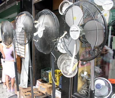
Nice repeating pattern, but too cluttered
I thought the row of floor-stand fans, receding from right to left, would anchor the image. It sure seemed like a good idea at the time. But the background here is definitely too cluttered. The girl in pink at left with a "Ventilaire" for a head doesn't help much either.
Yet another photo for the August road trip - this one taken on MacDougal Street in The Village. I saw the bright red pedicab and the driver's bright yellow t-shirt and snapped away. But the result, I think, is too static-looking, and it just doesn't give any sense of the funky Greenwich Village surroundings.
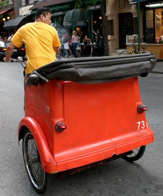
Colorful, but static
This final photo really is The One That Got Away. It's from a May 2003 day trip to NYC. After hours of sightseeing fun, I was just a block away from where I was to meet our ride back home when I saw this bridal couple crossing Seventh Avenue. I was on the other side 46th Street, and risked my life dodging three lanes of crosstown traffic to grab the shot.
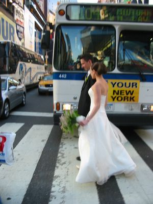
The One that Got Away
This time, everything was right - the composition, the lighting, the improbable juxtaposition of the elegant couple against a mundane MTA bus - everything, that is, except for the blur I induced by my paparazzi-like pursuit of the blissfully oblivious couple.
Like every other One That Got Away, what a heartbreaker!
So even though I must be violating some cardinal rule of psycho-photo-insecurity, here are some of my photos that I thought would work, but just didn't.
This first photo is actually the most recent. I took it on that overnight trip to Bethany Beach last month. Sandy and I headed a few miles South to Ocean City, Maryland, where I spotted these rows of colorful trestle tables at a closed-for-the-season crab shack.
It sure looked as if there would be something there! All that repeating pattern and nice colors in the sun... It looked pretty good on the camera's little LCD, too. But back home, even cropped, contrast-adjusted, and sharpened, it just falls flat.

Colorful, but so what?

Maybe it's the big triangle of nothing-gray at lower right - I just can't seem to crop it out and still maintain a coherent image. Maybe the background is too cluttered. Anyway, it just doesn't do anything for me. Another angle might have worked.
The next photo is from our epic road trip to Manhattan last August. While the kids were shopping in Chinatown, I took photos of the storefronts all along Canal Street. This one is just at the point where the old hardware-store district blends into Chinatown.

Nice repeating pattern, but too cluttered

I thought the row of floor-stand fans, receding from right to left, would anchor the image. It sure seemed like a good idea at the time. But the background here is definitely too cluttered. The girl in pink at left with a "Ventilaire" for a head doesn't help much either.
Yet another photo for the August road trip - this one taken on MacDougal Street in The Village. I saw the bright red pedicab and the driver's bright yellow t-shirt and snapped away. But the result, I think, is too static-looking, and it just doesn't give any sense of the funky Greenwich Village surroundings.

Colorful, but static

This final photo really is The One That Got Away. It's from a May 2003 day trip to NYC. After hours of sightseeing fun, I was just a block away from where I was to meet our ride back home when I saw this bridal couple crossing Seventh Avenue. I was on the other side 46th Street, and risked my life dodging three lanes of crosstown traffic to grab the shot.

The One that Got Away

This time, everything was right - the composition, the lighting, the improbable juxtaposition of the elegant couple against a mundane MTA bus - everything, that is, except for the blur I induced by my paparazzi-like pursuit of the blissfully oblivious couple.
Like every other One That Got Away, what a heartbreaker!


